Optimizing Homepage Design: A Guide to Effective Headers and Forms in 2026
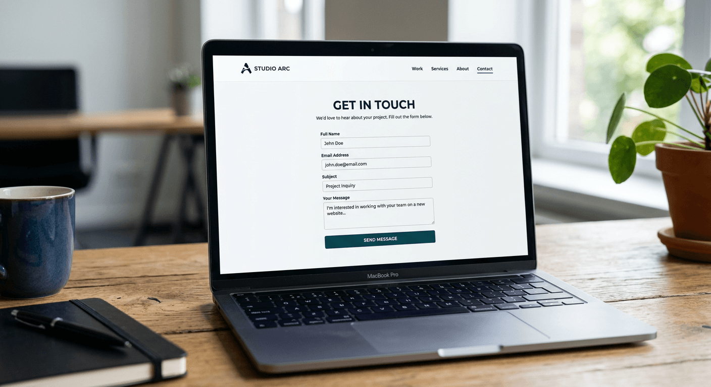
A high-performing website is built on the foundation of intuitive navigation and clear communication. For digital entrepreneurs and content creators, the homepage serves as the primary gateway to their brand. Mastering the balance between aesthetic appeal and functional architecture is critical for converting casual visitors into engaged followers or customers. By focusing on streamlined header design and friction-free form interaction, businesses can significantly improve their overall site performance.
Quick Summary
Optimizing your website involves aligning structural elements with user intent. An effective header provides instant clarity, while well-designed forms lower the barriers to conversion by prioritizing brevity and logical flow.
- Simplify navigation by limiting menu items to the most essential pathways.
- Reduce form friction by asking only for necessary information.
- Ensure visual hierarchy guides the user toward your primary call-to-action.
Table of Contents
- Quick Summary
- Website Header Design Fundamentals
- Strategic Form Design Website Layouts
- Common Pitfalls & Troubleshooting
- FAQ
- Recommended Reads

Website Header Design Fundamentals
The header is the first element a visitor interacts with, making it the most important component of your homepage design. A well-constructed header must communicate what your site offers within seconds. Start by keeping the logo prominent and left-aligned, as this aligns with the natural reading pattern in Western markets. Ensure the search bar or primary navigation links are positioned to prioritize the user's most likely goal, such as browsing a catalog or signing up for a service.
Beyond placement, the density of information in your header impacts conversion rates. Avoid the temptation to cram every category into the top navigation bar. Instead, use a "progressive disclosure" approach, where secondary pages are tucked under a clean menu structure. This reduces cognitive load, allowing users to focus on your core value proposition. Consider utilizing a HeyLink.me profile as a bridge for complex content portfolios to keep your main site header uncluttered and highly focused on the primary conversion goal.
Strategic Form Design Website Layouts
Forms are the bridge between a visitor and a business, but they are also the most common point of abandonment. Effective form design focuses on the user's psychological state. Every additional field you add is a tax on the user's time. Start by auditing your lead capture process: can you function with just an email address? If yes, remove name, phone number, and company fields unless they are absolutely critical for your initial outreach.
Visual cues are equally important. Use clear, descriptive labels that remain visible even after the user clicks into a field, rather than relying on placeholder text that disappears. Align form fields vertically to create a smooth, single-column reading experience. If a form must be long, such as for a detailed inquiry or application, break it into multiple steps using a progress bar. This visual confirmation of progress keeps users motivated to finish the process.
Pro Tip: Always test your forms on mobile devices specifically. Large touch targets and a mobile-friendly keyboard layout for each field type - ensuring the numeric pad appears for phone numbers, for instance - can boost conversion rates significantly.
Common Pitfalls & Troubleshooting
The most frequent error in homepage design is the lack of a clear visual hierarchy. When everything on the page screams for attention, the user ignores everything. Use whitespace liberally to separate your header and form sections from the rest of your content. If you notice a high bounce rate on your form landing page, check for "input fatigue" where the user feels overwhelmed by the complexity of the questions.
Technical performance is another common culprit. If your header contains high-resolution assets that take more than two seconds to load, your potential customers may leave before ever seeing your content. Optimize your images, minify your CSS, and ensure that your forms have server-side validation to prevent errors. If users are getting stuck, ensure your error messages are constructive, telling them exactly what went wrong and how to fix it rather than just flagging a field in red.
FAQ
How many links should I include in my website header?
Aim for no more than 5 to 7 primary links. Anything beyond this typically forces users to make too many choices, which leads to decision paralysis and reduced engagement.
Should I use a sticky header on my homepage?
Yes, a sticky header is highly effective for longer pages, as it ensures that the user always has access to your navigation and your primary call-to-action button without needing to scroll back to the top.
What is the ideal length for a contact form?
Keep it as short as possible. For lead generation, an email field is often sufficient. If you require more data, use conditional logic to show extra fields only when relevant.
How do I measure if my form design is working?
Track the completion rate using analytics. If you see a significant drop-off at specific fields, that is where your design needs adjustment to reduce user effort.