How to Execute a Landing Page Design That Converts
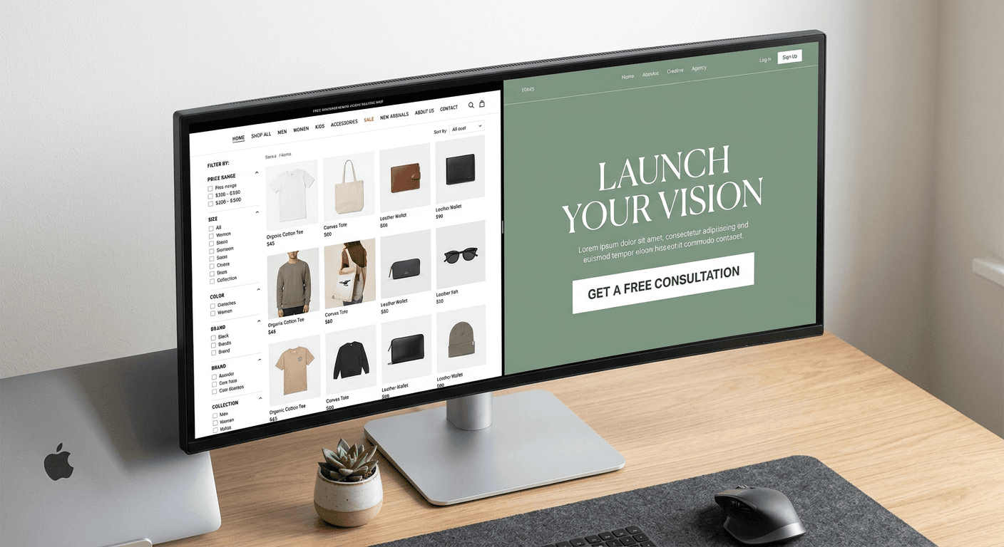
A widespread assumption among e-commerce operators and content creators is that a campaign destination is simply a shorter version of their main corporate site. They duplicate their standard navigation bar, copy the primary value proposition, and swap the hero image, expecting this modified page to act as a dedicated conversion funnel. This fundamentally misunderstands what a landing page design is built to do. A landing page is a walled garden engineered to force a single user decision based on a highly specific traffic source. When you treat it like a general directory, users behave exactly as they do on a directory: they browse aimlessly, they click away to secondary pages, and they leave without completing the action you paid to acquire them for.
Quick Summary
A landing page is a standalone web page created specifically for a marketing or advertising campaign, built to drive a single focused call to action. Unlike standard web pages, it actively restricts user choices to guide visitors toward a specific conversion event, such as a product purchase or newsletter sign-up.
- Removes all global navigation to prevent user leakage.
- Matches the visual hierarchy directly to the referring ad creative.
- Strips form fields down to absolute minimums to reduce cognitive friction.
- Isolates the user entirely from the broader corporate website structure.
Table of Contents
- Where traditional landing page design leaks traffic
- 1. Remove the global navigation
- 2. Match the website header design to the ad creative
- 3. Structure the page around a single conversion action
- 4. Compress the website form design
- 5. Separate the offer from the homepage design
- 6. Build for mobile constraints first
- Common Pitfalls & Troubleshooting
- FAQ
- Recommended Reads
Where traditional landing page design leaks traffic
The architecture of a standard website relies on exploration. By providing detailed menus, extensive footer links, and various cross-sells, standard web design assumes the user does not yet know what they want. A landing page operates under the opposite assumption: the user clicked an ad or a specific link-in-bio prompt because they want exactly what was promised in that specific call to action.
When a landing page provides exploratory options, it introduces cognitive load. The user must pause to evaluate whether to proceed with the intended purchase or to click the "About Us" link. Every micro-decision you force a user to make depletes their attention span. If your landing page design includes elements that do not actively answer objections or drive the user toward the primary button, it is actively leaking your paid traffic. The mechanics of a high-converting page rely on trapping the user's attention in a single, linear narrative that ends in a transaction.
1. Remove the global navigation
Frictionless exits destroy conversion rates
The most common structural error operators make when deploying a new campaign page is leaving the site's primary header and footer intact. The reasoning is usually brand consistency or technical convenience, but the result is a page riddled with exit routes. If a visitor arrives via a specific promotion for an online course, presenting them with a top navigation bar linking to your blog, contact page, and general services invites them to abandon the funnel.
To lock the user into the intended flow, you must strip away all global navigation. The header should contain nothing but your logo and perhaps a secure checkout badge. The footer should be reduced to mandatory legal links, such as the privacy policy and terms of service. This isolation forces the user to choose between the primary call to action and closing the browser tab entirely.
Practical rule: Never include a clickable element on a landing page that does not directly advance the primary conversion event.
The mistake practitioners make here is assuming users will eventually navigate back to the checkout after reading a blog post. They rarely do. Once the linear momentum of the purchase intent is broken, the user resets their context and typically leaves the site.
2. Match the website header design to the ad creative
Message mismatch triggers immediate bounces
During the split second before a landing page loads, the browser fetches content to satisfy the visitor's highly specific expectation. If the clicked ad promises a percentage-based discount on winter boots, the very first element they see on the destination page must explicitly confirm that exact offer. This visual and textual continuity is called message match.
A generic website header design that displays a standard brand slogan instead of the specific campaign promise creates an immediate trust deficit. The user is forced to scroll or search to verify they landed in the right place. During that search period, a significant portion of traffic will simply bounce.
The mechanics of establishing message match require you to mirror the exact headline, the primary color palette, and the specific hero imagery used in the referring ad. If the ad featured a bold, red typographic treatment, the landing page header must echo that exact treatment. The mistake designers make is treating the ad creative and the landing page as separate projects managed by different teams, resulting in a disjointed user journey where the page looks and sounds like a different company.
3. Structure the page around a single conversion action
Competing priorities dilute the user focus
A high-performing landing page demands a single, inescapable call to action. Whether you are building a consolidated link page for social media followers or a dedicated product funnel, asking the user to do two different things usually results in them doing neither.
If your primary goal is lead generation via an email opt-in, you cannot simultaneously ask the user to share the page on social media, read your latest case study, and subscribe to your podcast. Each additional request divides the user's attention. The mechanics of single-action design dictate that every button on the page, regardless of its position, must trigger the exact same event. You may have a button in the hero section and another at the bottom of the page, but both must route to the identical checkout or sign-up form.
The specific failure mode here is the "secondary CTA." Designers often introduce a low-commitment alternative, such as a ghost button reading "Learn More," placed right next to the primary "Buy Now" button. This gives the user an excuse to defer the purchase decision. If the page requires more explanation, put that explanation in the body copy; do not send the user to a different page to find it.
4. Compress the website form design
Every additional field suppresses the completion rate
Forms are the primary friction point of any digital transaction. The structural rule of data collection is that you only ask for the information required to execute the immediate next step. For a newsletter sign-up, that is solely an email address. For a digital download, an email and a first name.
An unoptimized website form design treats the user as a data-mining opportunity, asking for phone numbers, company sizes, and job titles before the user has received any value. Every input field you add requires the user to evaluate whether they trust you enough to provide that specific piece of data. This evaluation requires mental effort. If the perceived effort outweighs the perceived value of the offer, the user abandons the form entirely.
The mechanical optimization of a form involves both reducing the field count and optimizing the input types for mobile devices. Using the correct HTML input attributes ensures the user's device displays the appropriate keyboard - triggering the numerical keypad for phone numbers or adding the "@" symbol for email inputs. The common mistake is failing to inline the field validation. If a user makes a formatting error, the form must highlight the specific field immediately, rather than waiting for the user to press submit and returning a vague error message at the top of the page.
5. Separate the offer from the homepage design
Broad positioning fails specific search intents
The most expensive mistake in digital marketing is routing paid campaign traffic to a root domain. A standard homepage design functions as a corporate directory. It must speak to investors, returning customers, prospective employees, and casual browsers simultaneously. Because it must speak to everyone, its messaging is inherently broad.
When a user clicks a search ad for "freelance invoice templates," they do not want to read about your company's mission statement or see a carousel of your enterprise accounting software. They want the template. A dedicated landing page captures this specific intent by stripping away all corporate context and delivering only the solution to the search query.
Landing pages and homepages serve mechanically opposite functions. A homepage is designed to distribute incoming organic traffic to various internal subpages based on user preference. A landing page is designed to catch highly targeted traffic and prevent it from going anywhere else. Using one in place of the other guarantees poor performance across both use cases.
6. Build for mobile constraints first
Desktop-first layouts break on vertical screens
The vast majority of social media traffic and a significant portion of search traffic occurs on mobile devices. Despite this, most landing pages are still designed on large horizontal monitors, leading to structural failures when those designs are forced onto narrow vertical screens.
The mechanics of mobile-first design require you to account for the physical constraints of a phone. Elements that sit comfortably side-by-side on desktop will stack vertically on mobile. If your design features a large hero image on the left and the form on the right, the stacking order on mobile often pushes the form entirely below the fold, forcing the user to scroll before they even realize what the page is asking them to do.
Furthermore, tap targets must be physically large enough to press without zooming. The primary button must span the width of the screen and remain fixed in a highly visible area. The common mistake is using fixed height dimensions (like 100vh) in the CSS, which frequently breaks on mobile browsers when native navigation bars appear and disappear as the user scrolls, covering up crucial conversion elements.
Common Pitfalls & Troubleshooting
When a landing page underperforms, the symptoms often look identical from the outside: low conversion. However, the underlying mechanical failures require entirely different fixes. This is the most common cause of wasted ad spend.
Symptom: High click-through rate on ads, but zero time on page (immediate bounces). Diagnosis: This is almost always a message mismatch or a catastrophic load time issue. The user felt misled by the transition from the ad to the page, or the page took so long to render they abandoned it. Fix: Pull the exact headline from your best-performing ad and make it the H1 of the landing page. Compress all hero images and strip out unnecessary JavaScript to ensure the above-the-fold content loads instantly.
Symptom: High time on page, but low conversion rates. Diagnosis: The user is interested enough to read the content, but the call to action is either buried, unclear, or asks for too much commitment upfront. The user does not know what exactly happens when they click the button. Fix: Rewrite the button copy from a generic "Submit" to an action-oriented promise, such as "Send My Free Template." Ensure the button contrasts heavily with the background color.
Symptom: Scroll maps show users stopping completely above the fold. Diagnosis: The page suffers from a "false bottom." The hero section is designed in a way that perfectly fills the screen, giving no visual cue that more content exists below. Fix: Adjust the hero section's padding so that the top of the next section is slightly visible at the bottom of standard screen sizes, encouraging the user to pull down.
Symptom: Form abandonment mid-typing. Diagnosis: The form is too long, asks for sensitive information without justification, or has broken mobile input fields. Fix: Cut all fields except email. If you must ask for a phone number or company name, clearly state exactly why you need it next to the field.
FAQ
Should I use a custom domain for my landing pages? Using a custom domain builds immediate trust. If you are a creator or a growing brand using an all-in-one platform to host your links or digital products, pointing those pages to a recognizable, branded domain prevents users from feeling like they have been sent to a third-party directory. It signals professional permanence.
How long should a landing page be? The length of a page must scale with the complexity and cost of the offer. A page offering a free digital download in exchange for an email only needs a hero section, a brief list of benefits, and a form. A page selling a high-ticket software subscription requires extensive space for social proof, feature breakdowns, and objection handling.
Can I run multiple different ad campaigns to the same landing page? Only if the intent of the campaigns is identical. If you are targeting two entirely different audiences with distinct pain points, routing them to the same generic page dilutes the message for both. You should clone the page architecture and adjust the specific headlines to match each distinct traffic source.
How do I test if my call to action is obvious enough? Apply the blur test. Take a screenshot of your landing page and apply a heavy Gaussian blur filter to the image until the text is unreadable. If the primary conversion button is not immediately obvious as the most prominent element on the page, your visual hierarchy is broken and needs adjustment.