How to Design a Website: The Professional Guide to Architecture and Layout
A standard grid layout will break when rendering on diverse mobile viewports if the designer relies entirely on absolute pixel values instead of fluid container widths. The failure rarely happens on the designer's primary monitor; it happens in the hands of the actual user, resulting in cut-off text, horizontal scrolling, and abandoned sessions. Understanding how to design a website requires moving past visual aesthetics to focus on structural integrity, performance budgets, and user routing.
Far too many digital entrepreneurs treat web design as a purely visual exercise. They select a template, populate it with high-resolution images, and assume the platform will handle the underlying mechanics. This approach fundamentally misinterprets what a digital layout is supposed to do. A successful digital presence is an engineered system that directs attention, minimizes loading friction, and converts passing traffic into committed users. You must build the skeleton before you paint the skin.
Quick Summary
Designing an effective digital layout is the process of structuring information, selecting the appropriate technical infrastructure, and building scalable visual components that load efficiently across all devices. It prioritizes user navigation and conversion mechanics over decorative elements.
- Establish a wireframe hierarchy before writing code or selecting a theme.
- Match your hosting infrastructure to your actual traffic routing needs, avoiding over-engineered platforms.
- Base your layout on a mathematical typographic scale and fluid CSS grids.
- Compress assets and configure caching to eliminate cumulative layout shifts and slow load times.
Table of Contents
- 1. How to Design a Website: Structural Architecture
- 2. Selecting the Technical Infrastructure
- 3. Establishing the Visual Hierarchy
- 4. Constructing the Component System
- 5. Optimizing for Performance and Localization
- 6. Auditing Cost and Deployment
- Common Pitfalls and Troubleshooting
- FAQ
- Recommended Reads
1. How to Design a Website: Structural Architecture
The foundation of any digital build is its architecture, not its color palette. Navigation dictates interaction. If a user cannot determine where they are and how to reach the checkout or contact page within three seconds, the aesthetic merits of the page are irrelevant. You must map out the exact sequence of steps a visitor will take from their initial entry point to your intended conversion goal.
Mapping the Content Hierarchy
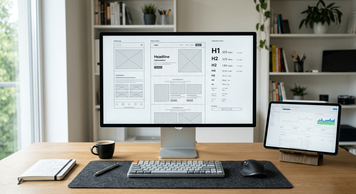
The mechanics of this step involve low-fidelity wireframing. You strip away all colors, images, and typographic styling to look purely at the boxes that will hold your content. Determine the primary call to action (CTA) for each page and position it in the most accessible viewport area. Establish a clear parent-child relationship between your home page, category pages, and individual detail pages.
The mistake people actually make here is building the visual layout concurrently with the site map. Designers often skip the wireframing phase. They jump straight to styling. This forces essential information into rigid, pre-designed containers that were never built for that specific content. This leads to orphaned pages. These destinations exist on the server but have no logical internal links pointing to them, leaving users at a dead end.
2. Selecting the Technical Infrastructure
The underlying content management system (CMS) or framework you choose dictates the scalability, security, and maintenance overhead of your entire operation. A platform should match the complexity of the business model, as forcing a simple project into an enterprise-grade framework guarantees wasted resources.
Matching the Platform to the Audience
Small business owners, social media influencers, and content creators routinely overestimate the technical infrastructure they require. A full-scale CMS with custom routing, a heavy relational database, and bespoke plugin architectures makes perfect sense for a massive e-commerce operation cataloging thousands of distinct SKUs. However, it is entirely the wrong tool for an online store owner whose primary goal is funneling social media traffic to five key product pages or a scheduling tool.
For the latter, deploying a consolidated link-in-bio platform or a dedicated branded landing page provides the exact same conversion utility at a fraction of the cost. According to industry pricing structures, lightweight consolidated platforms often cost around €10 per month, effectively disrupting traditional European web development costs that can easily exceed €987 per month in hosting, licensing, and agency retainers.
The mistake people make at this stage is chronic over-engineering. They deploy a heavy WordPress installation for a simple portfolio or social routing task, exposing themselves to constant plugin updates, database vulnerabilities, and sluggish load times, when a secure, centrally hosted landing page would have solved the exact same problem with zero maintenance.
3. Establishing the Visual Hierarchy
Visual hierarchy directs the user's eye through a predetermined sequence of information. In modern website design, this relies far more on spacing and typography than on borders, background colors, or decorative graphics. You are training the user on what matters most by manipulating size, contrast, and negative space.
Typographic Scaling and Contrast
The mechanics of visual hierarchy start with a typographic scale. Instead of arbitrarily picking font sizes for your headings and paragraphs, use a mathematical ratio (such as a 1.250 modular scale) to generate a proportional set of text sizes. Combine this with the strategic use of whitespace. Elements that belong together functionally must sit closer together visually.
Practical rule: Set your typography scale mathematically before you draw a single container, limiting yourself to a maximum of three font weights for the entire project.
The most frequent mistake designers make here is treating whitespace as empty real estate that needs to be filled. They cram secondary calls to action, social media icons, and newsletter signups into the hero section, destroying the focal point. When everything on the screen screams for attention through bright colors and large text, the user registers none of it and simply scrolls past.
4. Constructing the Component System
A robust digital layout is not a collection of independent pages; it is a system of reusable components. Button styles, product cards, navigation bars, and form inputs should be standardized globally so that updating the system requires changing one variable rather than editing fifty separate pages.
Designing for State Changes
Proper website design mechanics require building these components using CSS variables (custom properties) and modern layout modules like Flexbox or CSS Grid. You define your primary brand color once at the root level. When you build a button, you reference that root variable. You must also account for state changes: how does the button look when the user hovers over it, clicks it, or when the system disables it due to a form error?
The mistake practitioners make during component design is hardcoding styles inline or creating unique, one-off CSS classes for individual elements. If you design a card for the blog section and then design a completely different, slightly wider card with a different border radius for the services section, you fracture the user experience and double your maintenance workload.
5. Optimizing for Performance and Localization
Performance is a foundational design metric. A layout that looks stunning but requires four seconds to render the first contentful paint will bleed traffic before the user even sees the hero image. Furthermore, the structural design must accommodate the legal and regional expectations of the target audience.
Asset Compression and Regional Compliance
To optimize performance, you must serve images in next-generation formats like WebP, lazy-load all off-screen media, and aggressively minify your CSS and JavaScript payloads. On the localization front, targeting specific European markets requires structural foresight. For businesses operating in Germany, the approach to website gestalten requires integrating strict GDPR compliance, cookie consent management, and a dedicated Impressum (imprint) directly into the primary navigation architecture rather than bolting it on as an afterthought.
The mistake routinely made here is loading full-resolution desktop assets onto mobile viewports. Designers will upload a 4MB header image and rely on CSS to shrink its dimensions for mobile users. The browser still has to download the entire 4MB file over a cellular connection, crippling the page speed and drastically lowering search engine rankings.
6. Auditing Cost and Deployment
The final phase of layout creation involves moving the local or staging build to a live production environment. This is where hidden costs and deployment bottlenecks reveal themselves, particularly for those trying to bootstrap their infrastructure.
Controlling Total Cost of Ownership
Mechanically, deployment involves connecting your hosting environment to your domain registrar, configuring your DNS records (A and CNAME records), and provisioning an SSL certificate to ensure encrypted traffic. You must evaluate the total cost of ownership, which includes ongoing bandwidth, platform fees, and security renewals.
Digital entrepreneurs evaluating a website erstellen kostenlos model quickly discover the inherent trade-offs of zero-cost hosting tiers. The failure mode here is assuming "free" means without cost. Free builders typically recoup their expenses by forcing intrusive competitor advertisements onto your layout, artificially capping your monthly bandwidth to force an upgrade, or refusing to let you connect a custom, professional domain name. The mistake is committing hours of labor to build a layout on a free platform, only to realize the platform holds your brand equity hostage behind a paywall when you attempt to scale.
Common Pitfalls and Troubleshooting
Even with a disciplined component system and clear architecture, digital layouts frequently fail under live traffic conditions. The following are the most distinct failures that look identical to a frustrated user but require completely different technical interventions.
Cumulative Layout Shift (CLS) on Load This is the most common real cause of a degraded user experience.
- Symptom: The user attempts to click a button or a link as the page is loading, but a split-second before their finger makes contact, an image or an ad loads above it, pushing the button down and causing the user to click the wrong element.
- Fix: The browser does not know how much space to reserve for media until the file fully downloads. You must set explicit
widthandheightattributes directly on every<img>and<iframe>tag in your HTML. This reserves the exact visual box required, preventing the layout from shifting once the media arrives.
Mobile Viewport Overflow (The Horizontal Scroll)
- Symptom: When viewing the page on a smartphone, the user can accidentally drag the screen to the left, revealing a blank white column of empty space running down the right side of the screen.
- Fix: An element on your page is wider than the device screen. This is almost always caused by a container, image, or preformatted text block that has an absolute width defined (e.g.,
width: 600px). Inspect the CSS and replace absolute horizontal values withmax-width: 100%, ensuring elements shrink to fit their parent containers.
The Flash of Unstyled Text (FOUT)
- Symptom: The page loads initially displaying a generic system font (like Times New Roman or Arial). A second later, the text visibly blinks and changes into your custom, branded web font.
- Fix: The custom font file is blocking the render, or the browser is swapping it late. To resolve this, add
font-display: swap;to your CSS@font-facedeclaration. This explicitly instructs the browser to use a seamless fallback system font immediately, maintaining readability while the custom typography loads in the background.
Form Submission Hangs
- Symptom: A user fills out the contact or checkout form and hits submit. The button clicks, but nothing happens - no error message, no success screen, just a static page.
- Fix: This is rarely a CSS issue; it is a JavaScript conflict or a missing default prevention. Check the browser console. Often, a script error elsewhere on the page has halted all JavaScript execution, breaking the asynchronous form submission. The immediate fix is to ensure your form has a standard HTML
actionfallback that routes to a confirmation page if the JavaScript fails to execute.
FAQ
What is the best width for a desktop layout container? A standard maximum width for a central content container is typically between 1140px and 1280px. Pushing content wider than this forces the user's eyes to physically track left and right to read paragraphs, which severely degrades reading comprehension and causes fatigue.
Should I design for mobile or desktop first? You should always design for the mobile viewport first. It forces you to prioritize the absolute most critical information. It is significantly easier to take a focused mobile design and expand it across a wide desktop monitor than it is to take a sprawling desktop layout and cram it into a mobile screen.
Do I need a database for a simple portfolio or link portal? No. If your content rarely changes and does not require complex user logins or inventory tracking, a relational database introduces unnecessary security risks and latency. Static site generators or dedicated landing page platforms serve this purpose much faster and with greater reliability.
How do I prevent my custom typography from slowing down my site? Limit your custom web fonts to two families at most, and only load the specific font weights you actually use (typically 400 for regular body text and 700 for bold headings). Serve them locally or utilize a robust Content Delivery Network, and ensure you compress the font files into the modern WOFF2 format.