How to Design a Website: A Comprehensive Professional Guide for 2026
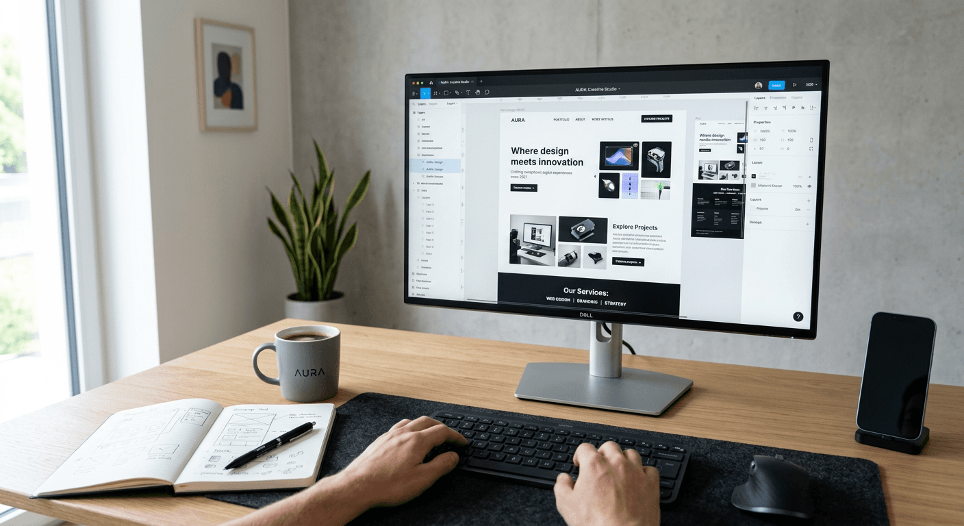
Designing a professional digital presence requires a structured approach that balances aesthetic appeal with technical performance. Whether you are building a personal portfolio or a scalable landing page, understanding the fundamentals of modern web architecture is essential for long-term success. Professionals today prioritize user experience (UX) and conversion-focused layouts, ensuring that every element on the screen serves a specific purpose in the user journey.
Quick Summary
Learning how to design a website involves a blend of visual planning, technical execution, and user-centric strategy. By utilizing robust design software and clean code practices, creators can build efficient, responsive, and high-converting platforms that reflect their brand identity effectively.
- Define user personas and primary conversion goals.
- Leverage vector-based prototyping tools for iterative design.
- Prioritize mobile-first responsiveness and page load speed.
- Implement consistent typography and color hierarchy.
Table of Contents
- Defining the User Journey
- Prototyping with Professional Design Tools
- Implementing Responsive Design Principles
- Optimizing for Conversion and Performance
- Common Pitfalls and Troubleshooting
- FAQ
- Recommended Reads

Defining the User Journey
Before opening a web design program, you must outline the logical flow of your site. A professional website design starts with wireframing the path a visitor takes from the initial landing point to the desired conversion action. This process requires mapping out pages, navigation structures, and interactive elements to ensure the layout remains intuitive.
Effective planning prevents feature creep and helps maintain a cohesive visual identity. By documenting the content hierarchy early, you ensure that high-value information, such as calls-to-action or contact forms, remains prominent across all device sizes. This planning phase forms the foundation for HeyLink.me - One Link for Everything, which simplifies the delivery of multiple digital destinations into a single, cohesive experience.
Prototyping with Professional Design Tools
Modern UI/UX professionals rely on sophisticated software to bridge the gap between abstract concepts and functional interfaces. Using a tool like Figma for web design allows for high-fidelity prototyping, which enables stakeholders to interact with a site's layout and logic before any development occurs. This iterative process is crucial for identifying usability friction points in navigation or form input.
Figma website design workflows allow designers to create master components, text styles, and color palettes that keep the entire project consistent. When you manage these assets within a single environment, you significantly reduce the time spent on manual adjustments, allowing for a more agile design process. Always ensure your design files include descriptive naming conventions for layers and assets, which streamlines the handoff between the design phase and the implementation phase.
Pro Tip: Use auto-layout features within your design software to automatically adjust spacing and alignment as your content scales. This practice mimics how browsers handle responsive content, reducing the chance of design errors during development.
Implementing Responsive Design Principles
Responsive design is the industry standard, ensuring that your layout adapts fluidly to various screen sizes. Instead of designing for one specific resolution, focus on flexible grids and media queries. A site that looks perfect on a desktop but fails on a mobile device will negatively impact SEO and user retention.
Focus on touch-friendly targets, such as button sizing and input padding, which must accommodate mobile users. When styling your elements, use relative units like percentages, REM, or VW (viewport width) instead of fixed pixel widths. This approach ensures that your content remains legible and accessible regardless of whether a user is accessing the site via a tablet, smartphone, or ultra-wide desktop monitor.
Optimizing for Conversion and Performance
Performance is an integral component of design. A visually stunning site that takes six seconds to load will lose the majority of its traffic before the user even sees the content. Optimize all images and media assets for the web before integration, and minimize the use of heavy scripts or unnecessary third-party plugins that can bloat your codebase.
Conversion-centric design involves reducing friction. Keep contact forms minimal, provide clear navigation paths, and ensure your site’s hierarchy leads the eye to the most important information. By using integrated analytics to monitor user behavior, you can continuously refine your design to better meet the needs of your audience based on actual engagement data rather than assumptions.
Common Pitfalls and Troubleshooting
Common issues in web design often stem from inconsistent branding or poor readability. If your font sizes are too small or your color contrast ratio is insufficient, you will alienate a significant portion of your audience. Always check your design against accessibility standards to ensure that content is readable for all users.
Another frequent mistake is overloading a page with too much content, leading to cognitive fatigue. If users struggle to identify the main purpose of a page, they will leave. To troubleshoot, perform 'blind' usability testing where you observe a new user attempting to complete a specific task on your site without your guidance. If they get stuck or confused, your layout or navigation needs refinement.
FAQ
Which features are most important for modern web design?
Modern web design should prioritize responsive layouts, fast loading speeds, accessibility, and intuitive navigation. A clean, uncluttered visual hierarchy is also vital to guide user attention toward conversion goals.
How does design software impact the development process?
Professional software allows for high-fidelity prototyping, which saves time by clarifying the site's functionality before coding starts. It also provides developers with precise specifications for spacing, colors, and asset exports.
Why is mobile-first design essential?
Since the majority of web traffic now originates from mobile devices, designing for the smallest screen first ensures that your content is optimized for the most common use case and maintains peak performance.
What is the primary difference between a wireframe and a prototype?
A wireframe is a skeletal, low-fidelity blueprint showing the structure and placement of elements. A prototype is a high-fidelity, interactive model that simulates how a user will experience the final site.