The Ultimate Guide to Modern Website Design in 2026
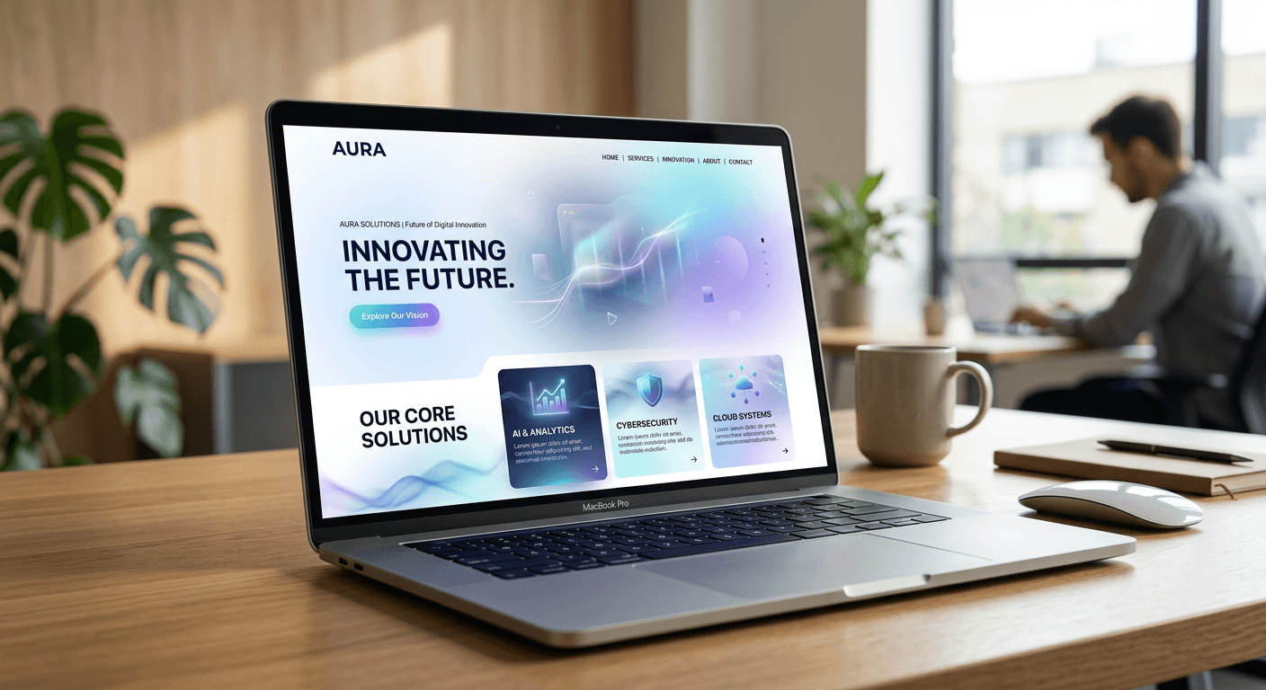
Building a website in 2026 feels less like coding and more like sculpting digital clay. We have moved past the era of static, brochure-style pages that just sit there gathering digital dust. Modern website design is all about movement, intentional white space, and an almost aggressive focus on user experience that makes visitors feel like the site is reading their minds. If you ask me, the best designs right now are the ones that disappear - you do not notice the interface, you just feel the flow of the content. It is a balancing act between high-tech interactivity and a clean, human-centric aesthetic that keeps people from bouncing the moment they hit the landing page.
Quick Summary {#quick-summary}
Modern website design in 2026 combines hyper-personalized user experiences with AI-driven layout adjustments and fluid, motion-heavy interfaces. It prioritizes accessibility, lightning-fast load times, and minimalist aesthetics to reduce cognitive load, ensuring that visitors engage naturally with digital content across any device or screen size without friction.
- Prioritize accessibility from the first line of code.
- Embrace motion design to guide user focus.
- Use AI for dynamic, responsive layout adjustments.
- Keep navigation invisible yet perfectly intuitive.
Table of Contents {#table-of-contents}

Modern Website Design Standards {#modern-website-design-standards}
Let’s be real for a second: the "grid" is dead. Well, not dead, but it has evolved into something far more fluid. A truly modern website design relies on asymmetrical layouts that break the traditional four-corner constraints we were obsessed with back in the early 2020s. Think of a layout as a conversation - it should ebb and flow based on what the user is actually doing. If you are looking for resources to sharpen your craft, check out this guide on creative website design strategies to see how pros are handling this shift.
The Importance of Micro-Interactions
Have you ever wondered why a site just feels "snappy"? It is almost always down to micro-interactions. These tiny, barely-there animations confirm actions without being annoying. A button that glows when you hover, a progress bar that shifts colors as you scroll, or a subtle vibration on a mobile device—these are the glue of the modern web. They provide immediate feedback, which makes a site feel alive instead of static.
Creative Web Design Tactics {#creative-web-design-tactics}
Creative web design today demands a departure from the "too much is never enough" philosophy. We are seeing a resurgence of brutalist typography paired with extremely soft, almost dreamy photography. It sounds like a clash, right? Somehow, it works. By stripping away heavy toolbars and replacing them with intuitive gesture controls, you create a sense of discovery. A visitor shouldn't have to hunt for the menu. If your navigation is hiding from the user, you have already lost half of them. You can find some excellent examples of modern website design inspiration if you spend enough time researching current industry trends.
Embracing Generative Assets
Static stock photos are officially a relic of the past. Why use a photo of a person pretending to hold a coffee cup when you can generate assets that perfectly match your brand’s unique color palette? Using AI to create bespoke visuals ensures that your site feels consistent. Just don't overdo it. The goal is to enhance the story, not to turn your website into an art gallery of computer-generated chaos.
Website Design Inspiration for 2026 {#website-design-inspiration-for-2026}
Where does the best inspiration come from? Honestly, it’s usually from industries outside of tech. Look at print magazines, architecture, or even old-school film posters. The best designers are the ones who steal from everywhere. Minimalism is a powerful tool, but in 2026, it is getting a personality transplant. We call it "maximalist minimalism." It uses plenty of space, but the elements that remain are bold, unapologetic, and highly expressive.
Dark Mode as the Default
Dark mode isn't just an option anymore; it is often the preferred state for power users. Designing for dark mode from the ground up—not just flipping a switch on your CSS—means you have to rethink your contrast ratios. It is about depth. Layers of shadow, subtle gradients, and glowing accents can make a dark-themed site look incredibly premium compared to the harsh, high-contrast light mode designs of yesteryear.
Responsive Is Now Adaptive
We used to talk about mobile-first as a trend. Now, it is the only way to exist. But we need to go further. Your site should adapt to the user's intent. If someone is on a desktop, give them the deep dive. On mobile, strip the noise and get straight to the conversion point. It sounds simple, right? It takes an immense amount of planning, but the payoff is a site that feels like it belongs on whatever screen it's on.
FAQ {#faq}
Does SEO still matter in 2026?
SEO is more critical than ever, though it is less about keywords and more about user intent and technical health.
Is custom code better than a builder?
Both have their place. Custom code offers total control, but modern drag-and-drop tools are finally reaching the point of being genuinely capable.
How often should I redesign?
If your bounce rate is creeping up or your site feels slow on modern devices, it is time for a refresh. Aim for a major audit every two years.