Professional Figma Website Design Techniques
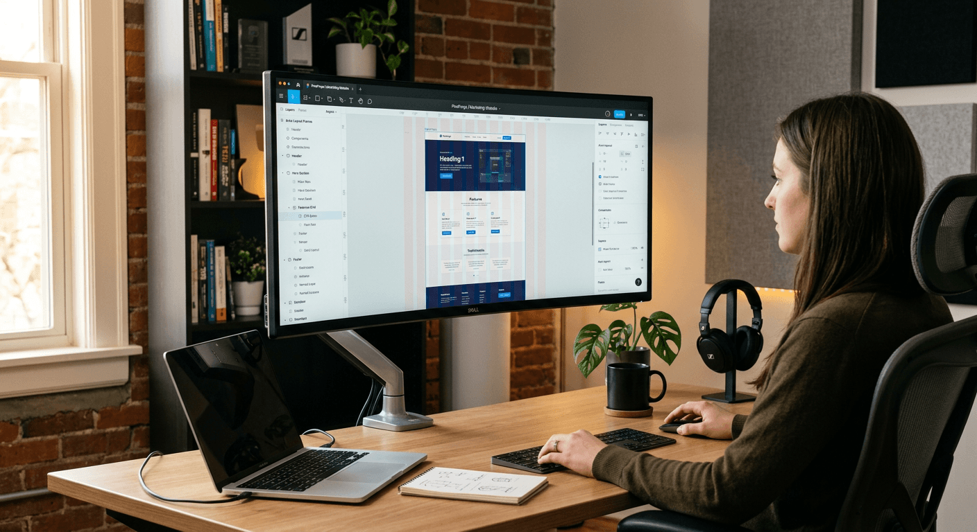
Mastering Figma website design requires more than just moving shapes around a canvas; it demands a structured approach to systems, scalability, and user-centric workflows. Whether you are a solo entrepreneur or part of a digital agency, leveraging this platform effectively can significantly accelerate your prototyping and development handoff process. By optimizing your workspace and utilizing advanced component architectures, you can create high-fidelity layouts that translate seamlessly into functional web environments.

Quick Summary {#quick-summary}
Figma website design involves creating scalable, high-fidelity prototypes and UI kits that streamline the transition from concept to code. Effective workflows rely on component-based architecture, auto-layout constraints, and robust style systems to ensure design consistency and efficient team collaboration during the development phase.
- Utilize Auto Layout to build responsive, fluid interfaces.
- Establish a global design system using Variables and Styles.
- Implement a component-based architecture for high reusability.
- Bridge the gap between design and development with precise handoff specs.
Table of Contents {#table-of-contents}
- Foundations of Figma Website Design
- Leveraging Auto Layout for Responsiveness
- Building Scalable Design Systems
- Streamlining the Development Handoff
- Common Pitfalls and Troubleshooting
- Frequently Asked Questions
- Recommended Reads
Foundations of Figma Website Design {#foundations-of-figma-website-design}
Successful figma website design begins with setting up an organized file structure. Before drafting a single frame, establish a master file containing your color palette, typography scales, and iconography grid. This prevents the common mistake of "design drift," where inconsistencies creep in as a project scales. Professionals often use a dedicated "cover" page with project documentation and status tags to keep stakeholders aligned.
Furthermore, understanding the canvas environment is critical for high-impact online design. Leverage frames rather than simple rectangles to define your artboards, as frames possess the necessary properties for prototyping, scrolling behaviors, and constraints. When building a professional landing page, you should approach the layout with a 12-column grid system in mind, providing the necessary boundaries for responsive behavior across mobile, tablet, and desktop viewports.
Leveraging Auto Layout for Responsiveness {#leveraging-auto-layout-for-responsiveness}
Auto Layout is perhaps the most powerful engine within the software for handling modern web requirements. It allows elements to adapt to their content dynamically, mimicking the behavior of CSS Flexbox. By nesting auto-layout frames, you can create complex headers, navigation menus, and cards that expand or contract based on the text inside them. This eliminates the need to manually resize groups after every minor copy change.
To effectively use this feature, master the "Fill Container" and "Hug Contents" properties. When an element is set to "Hug Contents," it shrinks to fit its children; conversely, "Fill Container" forces the element to take up all available space in its parent frame. Combining these settings creates fluid designs that perform predictably when viewed at different browser widths. Platforms like https://heylink.eu.com rely on this modularity to ensure their digital interfaces remain consistent and user-friendly across various screen sizes.
Building Scalable Design Systems {#building-scalable-design-systems}
Scaling a project requires moving beyond static elements toward a component-based architecture. A component is an element that you create once and reuse throughout your project. If you update the master component, all instances across your design files reflect the change instantly. This is essential for maintaining global branding, especially when managing multiple pages or a large-scale website.
Advanced practitioners utilize Local Variables to manage design tokens. By defining specific values for spacing, corner radius, and color, you create a "source of truth" that makes theme switching-such as toggling between dark and light modes-effortless. This systematic approach saves hours of manual labor and ensures that your figma website design remains professional and compliant with your brand guidelines throughout the entire project lifecycle.
Streamlining the Development Handoff {#streamlining-the-development-handoff}
Efficiency in the handoff process determines how closely the final live website matches your design prototype. To minimize communication gaps with developers, group your layers logically and name them according to standard web conventions (e.g., "nav-bar," "hero-section," "footer-links"). Developers are far more likely to extract accurate CSS if your hierarchy reflects the semantic structure of HTML.
Additionally, use the built-in Inspect panel to verify that your padding, margins, and typography values are set to relative units where possible. Creating a "Developer Documentation" section within your Figma file, complete with interaction notes and variable exports, further reduces back-and-forth questions. By treating the handoff as a formal deliverable rather than just sharing a link, you elevate the quality of the final product and reduce time-to-market for the client or stakeholders.
Common Pitfalls and Troubleshooting {#common-pitfalls-and-troubleshooting}
One of the most frequent errors in figma website design is the "flattening" of layers. When designs are flattened, they lose their responsiveness and become impossible to edit at scale. Always keep your shapes, text, and Auto Layout frames editable. If you find yourself struggling with misalignment, check your Auto Layout settings for "clip content" or rogue padding that might be throwing off the grid.
Another common issue is using absolute positioning when Auto Layout would have been more effective. While absolute positioning has its place for overlays or specific UI badges, overusing it breaks the flow of the page and prevents the design from being responsive. If you encounter a situation where an element won't center correctly, reset the constraints and ensure the parent frame has the correct alignment properties applied.
Frequently Asked Questions {#frequently-asked-questions}
How do I ensure my Figma designs translate accurately to a real website?
By using Auto Layout correctly and adhering to a strict grid system, you mimic the logic of CSS. Always communicate your spacing and typography scale clearly to the development team to ensure the visual hierarchy remains intact.
Should I use plugins for my website design workflow?
Yes, but with caution. Plugins can automate tasks like batch-renaming, lorem ipsum generation, or exporting assets, but relying on too many can bloat your file. Stick to standard, well-supported plugins that enhance your core productivity.
Can Figma replace professional web development platforms?
Figma is an industry-standard prototyping and design tool, not a code editor. It serves as the blueprint for development, but the actual construction of the website still happens in code or through specialized site-building platforms that specialize in front-end execution.
What is the most important feature for beginners to learn first?
Auto Layout is the single most important skill. Mastering it allows you to create flexible, responsive components that are the foundation of all professional-grade digital design projects.