Mobile Design Best Practices: How to Design Websites for Mobile Phones
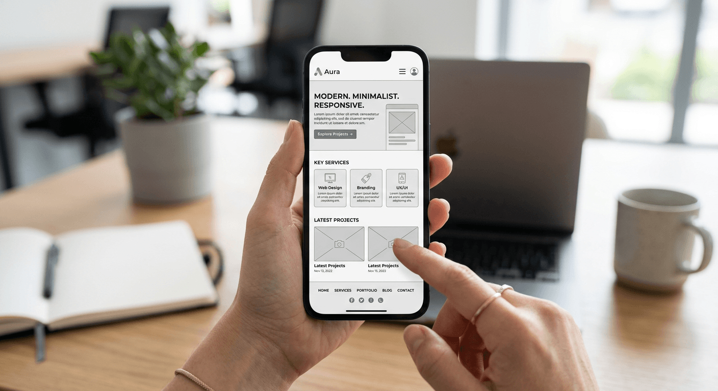
Designing a stellar experience when you want to design mobile website layouts is no longer a luxury; it is the absolute bare minimum for survival in today's digital landscape. If your site looks like a crushed desktop page on a smartphone, users will bounce faster than you can say -server error-. Honestly, the era of pinching and zooming is dead, and if you aren't prioritizing mobile-first thinking, you are basically throwing traffic into a black hole.
Quick Summary {#quick-summary}
Mobile design best practices involve creating responsive, touch-friendly interfaces that prioritize speed, legibility, and intuitive navigation for smaller screens. By focusing on simplified layouts and performance, you ensure a seamless user experience across all devices.
- Adopt a mobile-first responsive grid system.
- Prioritize fast loading times to prevent high bounce rates.
- Optimize touch targets to avoid accidental clicks.
- Maintain consistent visual hierarchy for easy scanning.
Table of Contents {#table-of-contents}
- Mobile Design Best Practices
- Structuring the Mobile Homepage Design
- Technical Aspects to Design Web for Mobile
- Refining Website Design on Mobile
- Recommended Reads

Mobile Design Best Practices {#mobile-design-best-practices}
Let’s be real - most developers treat mobile like an afterthought. They build the desktop version, then frantically try to squeeze it into a tiny viewport. This is a massive mistake. When you set out to design website for mobile, you should start with the smallest screen and build up. Why? Because it forces you to kill the fluff. If a feature or a massive image doesn't serve a purpose on a screen the size of a candy bar, it probably doesn't need to be there at all.
Structuring the Mobile Homepage Design {#structuring-the-mobile-homepage-design}
A cluttered homepage is the death of conversion. You have seconds - maybe less - to hook a visitor. If they land on your mobile site and see a wall of text or a confusing menu, they are gone. Simplicity is your best friend here. Keep it punchy. Keep it focused. And for goodness sake, make sure the primary call to action is visible without scrolling.
Prioritizing Content Hierarchy {#prioritizing-content-hierarchy}
Think of your mobile screen as a vertical column. What comes first? Your value proposition should hit them in the face immediately. Use clear, bold typography and generous white space. White space isn't empty space; it is breathing room for the eyes. It helps users focus on what actually matters instead of feeling overwhelmed by a chaotic layout.
Technical Aspects to Design Web for Mobile {#technical-aspects-to-design-web-for-mobile}
Performance is the invisible gatekeeper. If your mobile design website takes more than three seconds to load, your conversion rates will plummet. I have seen so many beautiful sites fail because they were bloated with high-resolution images that were never compressed. You need to be ruthless about optimization.
Optimizing Performance and Speed {#optimizing-performance-and-speed}
Compress your assets. Leverage browser caching. Minify your CSS and JavaScript files. It sounds like boring technical grunt work, but it is the difference between a high-ranking site and one that gets buried by Google. If the technical foundation is shaky, no amount of pretty design will save your project.
Refining Website Design on Mobile {#refining-website-design-on-mobile}
There is nothing more infuriating than "fat-finger syndrome." You know, when you try to tap a link and accidentally hit the wrong button? It’s a design failure, plain and simple. Every button, every icon, every interaction needs to be sized for actual human thumbs, not mice.
Touch Targets and Ergonomics {#touch-targets-and-ergonomics}
Industry standards suggest a minimum touch target size of 44x44 pixels. If you make them smaller, you are just inviting frustration. Also, consider thumb zones. Most users hold their phones with one hand. Placing your critical navigation at the bottom of the screen instead of the top can make a world of difference in user comfort. It feels more natural, right? It feels like the interface is actually working with the user, rather than against them.