Essential Tips for Effective Landing Page Design
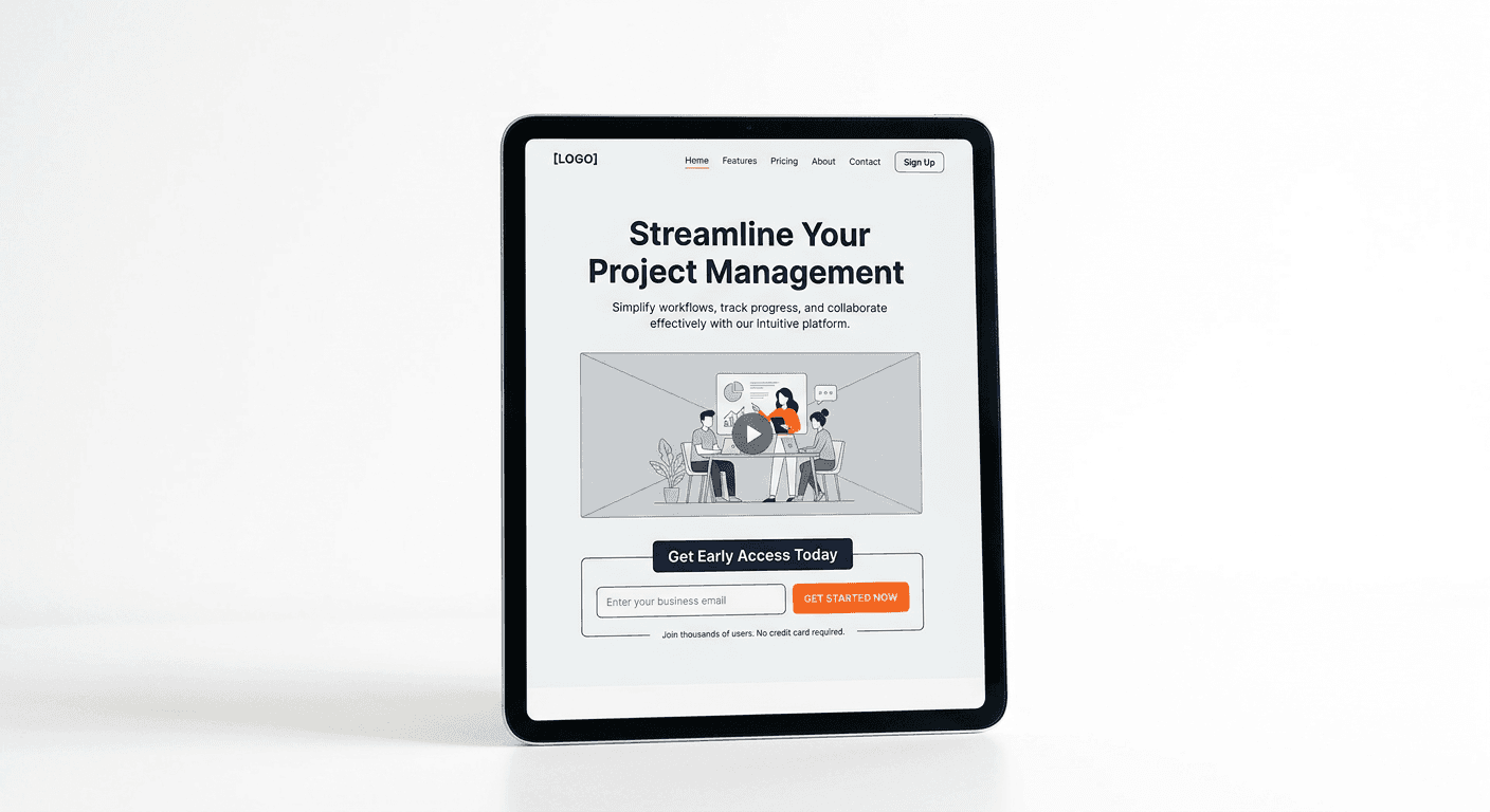
Optimizing landing page design is the most critical lever for increasing conversion rates and ensuring that your traffic results in tangible business outcomes. Unlike a general homepage, which serves as a navigational hub for a broad audience, a high-performing landing page acts as a focused funnel designed to guide visitors toward a specific action. By aligning visual hierarchy, persuasive copywriting, and functional interface elements, you can transform passive visitors into qualified leads or customers.
Quick Summary {#quick-summary}
Effective landing page design focuses on single-minded conversion goals by minimizing distractions and maximizing value alignment. By balancing aesthetic appeal with clear psychological triggers, businesses can lower bounce rates and improve ROI.
- Prioritize a single, clear call-to-action above the fold.
- Maintain visual consistency to build user trust.
- Streamline form fields to reduce friction.
- Use white space to draw attention to key conversion elements.
Table of Contents {#table-of-contents}
- Quick Summary
- Structuring the Website Header Design
- Mastering Form Design Website Elements
- Differentiating Landing Page Design vs Homepage Design
- Common Pitfalls and Troubleshooting
- FAQ
- Recommended Reads

Structuring the Website Header Design {#structuring-the-website-header-design}
The website header design is the first touchpoint for your visitors and dictates the immediate perception of your brand. A cluttered or confusing header can lead to immediate abandonment. To maximize conversion potential, your header must be minimalist, prioritizing navigation to the core offer while keeping extraneous links to a minimum.
Effective headers should strictly adhere to the 'less is more' principle. By removing social media links, search bars, or secondary navigational menus, you prevent the visitor from wandering away from the primary conversion goal. For those looking to streamline their digital presence and centralize their professional links, using tools like https://heylink.eu.com can provide a clean, uncluttered way to manage diverse traffic sources without distracting from the landing page itself.
Mastering Form Design Website Elements {#mastering-form-design-website-elements}
Form design website elements are arguably the most critical components of your conversion funnel. Every additional field in a form introduces friction and increases the likelihood that a user will drop off before submission. To achieve optimal performance, you must balance the data you need for your business with the effort you ask of the user.
Start by auditing your fields: do you really need a phone number, or is an email address sufficient for the initial contact? Implement smart defaults and inline validation to help users fix errors in real-time, preventing the frustration of a page refresh. Furthermore, ensure that the button text is action-oriented—avoid generic labels like 'Submit' in favor of descriptive phrasing that highlights the value, such as 'Get My Free Guide' or 'Start Your Trial'.
Pro Tip: Use multi-step forms if you require more than four pieces of information. Breaking a long form into smaller, digestible chunks reduces cognitive load and significantly increases completion rates.
Differentiating Landing Page Design vs Homepage Design {#differentiating-landing-page-design-vs-homepage-design}
Confusion often arises when stakeholders attempt to use a homepage as a landing page. While a homepage design is typically broad and serves as an entry point for users interested in the company’s entire ecosystem, a landing page is singular in its intent. A landing page should eliminate the navigation menu and focus exclusively on the specific offer being promoted, whether it is a white paper, a demo, or a purchase.
When creating a landing page, your layout should reflect a clear narrative arc: an attention-grabbing headline, a brief explanation of benefits, social proof, and a final, undeniable call to action. If you are managing multiple campaigns, remember that you can create specialized entry points that direct users to curated content; visit https://heylink.eu.com to understand how to manage your outbound traffic flows effectively. Keep the homepage for brand storytelling and the landing page for conversion.
Common Pitfalls and Troubleshooting {#common-pitfalls-and-troubleshooting}
A common error in landing page design is the 'leaky bucket' syndrome, where designers include too many outbound links, effectively handing visitors an exit ramp. Always ensure that the primary CTA is the only way forward for the user. Another frequent issue is poor mobile responsiveness; if your form is unreadable or the button is unreachable on a smartphone, you will lose a massive segment of your traffic.
If you notice high traffic but low conversions, perform A/B testing on your headline and your CTA button color. Sometimes a minor change in phrasing, such as switching from 'Buy Now' to 'Join for Free', can yield significant improvements in conversion rates. Monitor your page load speed as well, as every additional second of loading time correlates directly with a percentage drop in potential leads.
FAQ {#faq}
- What is the most important element on a landing page? The primary call to action (CTA) is the most critical element; it must be visible immediately without scrolling.
- How many links should a landing page have? Ideally, a landing page should have as few as possible, ideally only the links required for legal compliance or the primary conversion button.
- Does a landing page need a navigation bar? No, in fact, removing the navigation bar is a best practice for dedicated landing pages to keep users focused on the offer.
- How often should I test my landing page design? You should conduct continuous testing, starting with your headlines and CTA buttons, based on the volume of traffic you receive.