7 Tips for Perfect Homepage and Header Design
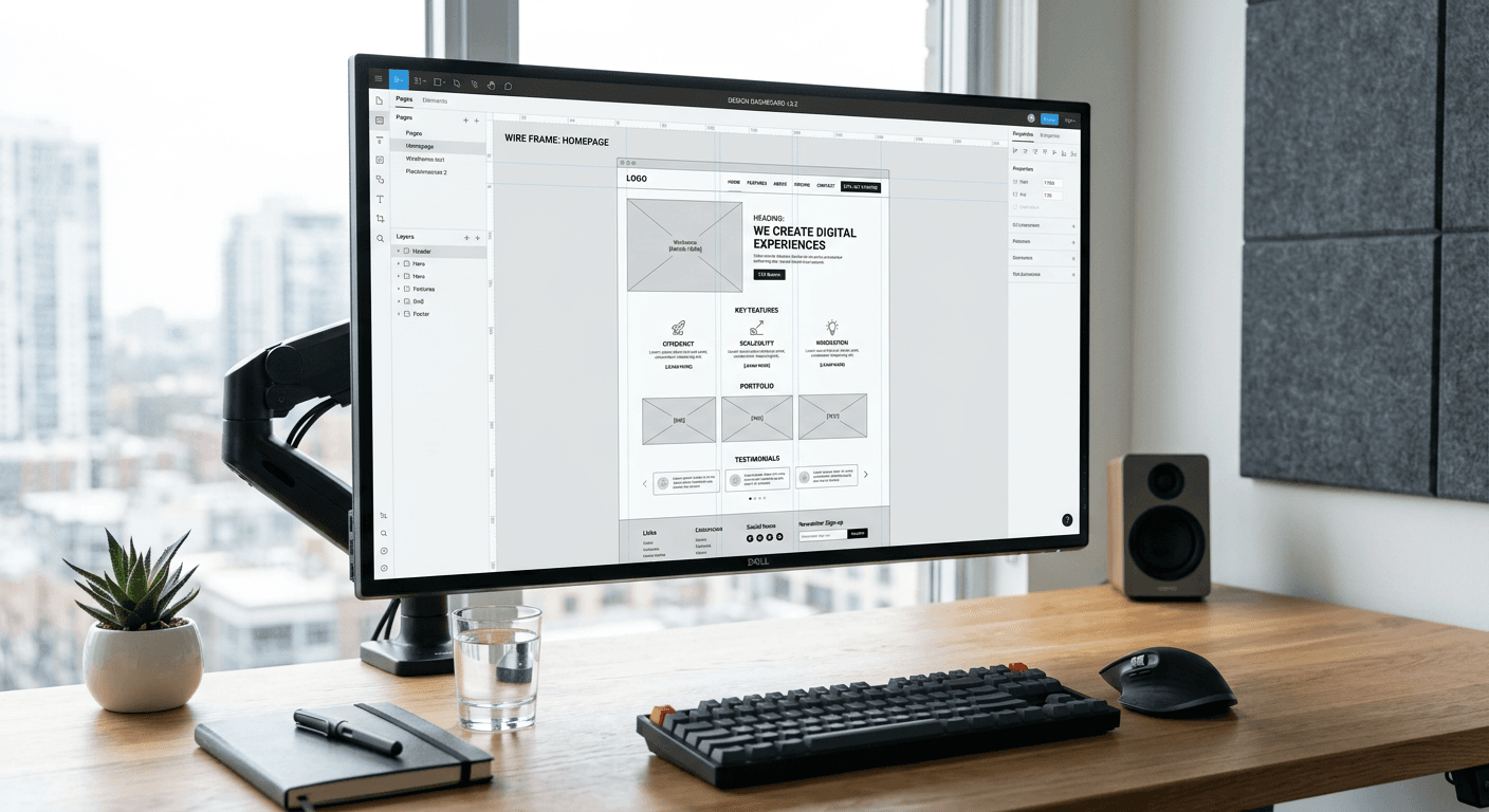
Optimizing homepage design and website header design requires a rigorous balance between visual aesthetics and high-conversion functionality. A professional web presence serves as the primary gateway for user acquisition, and the architecture of the landing page design dictates the user journey from the first pixel encountered to the final conversion action. By refining the information hierarchy and technical execution, businesses can transform static pages into high-performance assets that drive measurable growth through effective digital infrastructure.
Resumen rápido {#quick-summary}
Effective homepage design is the practice of structuring digital interfaces to prioritize clarity, speed, and user intent, ensuring visitors reach their objectives with minimal friction. Successful implementations rely on intuitive navigation, compelling value propositions, and strategic placement of interaction elements to convert traffic into long-term customer relationships.
- Prioritize a clean visual hierarchy to guide the user's eye toward primary conversion goals.
- Ensure all navigation elements remain accessible and descriptive to prevent bounce rates.
- Optimize page load speeds by compressing assets and minimizing external script dependencies.
- Utilize white space to isolate key messages, increasing cognitive ease for the visitor.
Tabla de contenidos {#table-of-contents}
- Prioritizing Visual Hierarchy
- Strategic Website Header Design
- Optimizing Landing Page Design
- Implementing Intuitive Form Design
- Structuring a Website Design Dashboard
- The Impact of Mobile Responsiveness
- Continuous A/B Testing Protocols
- [Preguntas frecuentes {#preguntas-frecuentes}
- [Lecturas recomendadas {#recommended-reads}

Priorizing Visual Hierarchy {#prioritizing-visual-hierarchy}
Visual hierarchy defines how information is ordered and perceived on a screen. By using size, color, and positioning, designers can control the user's focus. The most important elements - usually the value proposition and the call-to-action (CTA) - must command the highest visual weight through bold typography or contrasting color schemes. Sub-elements, such as secondary links or footer information, should recede, ensuring they do not compete for primary attention.
Effective implementation involves leveraging the F-pattern or Z-pattern reading habits common in Western audiences. By placing critical information along these natural scanning paths, you increase the likelihood that a user will process your core value proposition within seconds of arrival. Overcrowding this path with too many competing elements leads to decision fatigue, causing users to abandon the site before engaging with the content.
Strategic Website Header Design {#strategic-website-header-design}
The header serves as the anchor for the entire user experience. It must contain only the essentials: brand identity, core navigation links, and a primary CTA. Cluttering the header with excessive drop-down menus or social media icons forces the brain to work harder than necessary, increasing cognitive load and decreasing the conversion rate for vital digital service links.
From a technical perspective, the header should be 'sticky' or persistent as the user scrolls, but only if the design remains unobtrusive. This ensures that navigation is always available without forcing the user to scroll back to the top. By keeping the logo left-aligned and the primary conversion button visually distinct at the top right, you cater to long-standing user expectations for website architecture, which minimizes frustration and improves usability.
Optimizing Landing Page Design {#optimizing-landing-page-design}
Landing page design must remain laser-focused on a single objective. Unlike the broader homepage, the landing page should remove all non-essential navigation to eliminate exit paths. Every line of copy and every image must serve the singular purpose of persuading the visitor to complete a specific task, such as signing up for a newsletter, downloading an asset, or starting a trial.
High-performing landing pages utilize social proof, clear benefit-oriented headlines, and scarcity markers to influence behavior. By stripping away distractions, you create a focused funnel that forces the visitor to either convert or leave, rather than aimlessly wandering through peripheral site content. This creates a quantifiable metric for success that allows for rapid iteration and testing.
Implementing Intuitive Form Design {#implementing-intuitive-form-design}
Form design is the most critical hurdle in the conversion process. If a form is too long or requires unnecessary information, conversion rates drop significantly. Aim to reduce fields to the absolute minimum required for the business logic. Utilize inline validation to provide immediate feedback, ensuring that errors are identified before the user attempts to submit the form.
Furthermore, consider the layout of the form fields. A single-column layout is generally faster to scan and fill than multi-column configurations. Ensure that labels are placed above the fields rather than inside them, as internal placeholder text often disappears when a user begins typing, leading to confusion about what specific data is expected in that input box.
Structuring a Website Design Dashboard {#structuring-a-website-design-dashboard}
When managing complex digital properties, a website design dashboard is an essential tool for maintaining visual consistency. This involves creating a centralized style guide that dictates typography scales, color palettes, spacing units, and component states. By centralizing these assets, you ensure that every page across the domain feels like part of a unified ecosystem.
Beyond aesthetics, the dashboard should track technical performance indicators. Monitoring elements such as layout shifts, image compression efficiency, and component loading times allows for proactive optimization. When the underlying design system is organized, scaling the website becomes a modular process rather than an exercise in rebuilding components from scratch.
The Impact of Mobile Responsiveness {#the-impact-of-mobile-responsiveness}
Responsive design is no longer an optional feature; it is the default standard for modern web development. Mobile-first design requires prioritizing the user experience on smaller screens, where real estate is limited and touch targets must be clearly defined. Elements that work well on desktop, such as complex hover effects or high-resolution background videos, often translate poorly to mobile environments.
To ensure success, test your designs on real devices rather than just browser simulators. Touch targets should be at least 44x44 pixels to prevent 'fat-finger' errors. Additionally, consider how content stacks when the screen width narrows. If your layout shifts in a way that hides critical information, you are effectively breaking the user's ability to engage with your site.
Continuous A/B Testing Protocols {#continuous-ab-testing-protocols}
Optimization is not a one-time project but a continuous cycle of data-driven refinement. A/B testing allows you to challenge your assumptions about what works. By isolating variables - such as button color, headline copy, or form length - you can generate statistically significant results that inform your design strategy.
Never guess what your users prefer; test variations and track the outcomes in your analytics dashboard. Even small changes, such as modifying a call-to-action verb or increasing the size of a specific feature set, can result in double-digit percentage growth in conversion metrics. This scientific approach to design removes subjectivity from the process, ensuring every change is rooted in empirical performance data.
Preguntas frecuentes {#preguntas-frecuentes}
Why is whitespace important in design?
Whitespace reduces visual clutter and prevents cognitive overload. By giving elements room to breathe, you guide the user toward the most important content on the page.
How many links should be in a header?
Ideally, limit the primary header to 5-7 items. Anything more than that should be moved to a secondary navigation menu or a hamburger menu to preserve clarity.
How do I know if my landing page is effective?
An effective landing page has a clear, singular conversion goal. If your analytics show a high bounce rate but low time on page, your value proposition or headline likely fails to resonate with the traffic source.