10 Creative Website Design Ideas to Elevate Your Brand
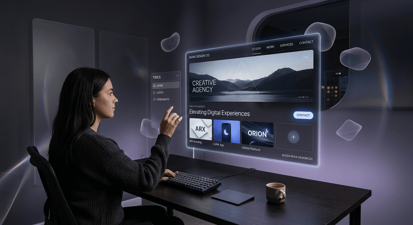
Modern digital presence requires more than a simple landing page; it demands an immersive experience that aligns with user intent while pushing aesthetic boundaries. Implementing high-impact website design ideas allows brands to differentiate themselves in an increasingly crowded marketplace, turning passive visitors into active brand advocates through intentional visual storytelling and intuitive functionality.
Quick Summary {#quick-summary}
Website design ideas are foundational strategies used to enhance user engagement, improve conversion rates, and solidify brand identity through visual and functional innovation. By integrating interactive elements, bold typography, and responsive layouts, designers create unique digital experiences that captivate audiences and ensure long-term brand recall across all devices.
- Utilize purposeful whitespace to reduce cognitive load.
- Implement interactive micro-animations for better user feedback.
- Prioritize mobile-first design to meet search engine standards.
- Blend accessibility with cutting-edge visual aesthetics.
Table of Contents {#table-of-contents}
- 1. Brutalist Web Design
- 2. Micro-Interactions and Motion
- 3. Typographic Hierarchy and Boldness
- 4. Storytelling Through Scrollytelling
- 5. Dark Mode and High-Contrast Themes
- 6. Personalized AI-Driven Interfaces
- 7. Minimalism with Intentional Texture
- 8. Immersive 3D and Augmented Reality
- 9. Fluid Grids and Organic Shapes
- 10. Bento Grid Layouts
- FAQ
- Recommended Reads

1. Brutalist Web Design {#1-brutalist-web-design}
Brutalist web design embraces raw, unrefined aesthetics, stripping away the polish of modern corporate templates. It features high-contrast color schemes, standard system fonts, and a lack of traditional symmetry. This style is intentionally stark, focusing on the core content rather than stylistic decoration, which provides a refreshing break from the homogeneity of standardized web frameworks.
Why It Matters: When your goal is to challenge conventions, brutalism serves as a powerful tool to demand user attention. It signals authenticity and confidence. For brands that thrive on unconventionality, this approach effectively cuts through visual noise, positioning the company as a trendsetter rather than a follower. If you are looking for ways to organize your digital assets while testing new layouts, platforms like https://heylink.eu.com can provide the structural foundation needed to manage traffic effectively.
2. Micro-Interactions and Motion {#2-micro-interactions-and-motion}
Micro-interactions are subtle animations that occur in response to user actions, such as a button color shift on hover, a smooth transition between pages, or a subtle bounce effect when filling out a form. These details add a layer of sophistication to the user experience, transforming a static site into a responsive environment.
Why It Matters: Motion provides essential feedback loops. Without these visual cues, users may feel detached from the interface. By providing constant confirmation that the system is responding, you increase user trust and satisfaction. Well-executed motion keeps the user engaged during loading states and transitions, ultimately lowering bounce rates and increasing the time spent on the page.
3. Typographic Hierarchy and Boldness {#3-typographic-hierarchy-and-boldness}
Large-scale, bold typography has moved beyond simple headers to become a central visual element in award winning websites design. Using oversized fonts allows designers to dictate the user's focus, creating a clear path for the eyes to follow and establishing an immediate brand voice that is both loud and legible.
Why It Matters: Text is no longer just for reading; it is a primary aesthetic component. By carefully curating font weight and scale, you establish a hierarchy that guides the user through the narrative of your site. This design choice ensures that even at a glance, the brand’s core value proposition is impossible to ignore, which is critical in capturing leads in the first three seconds of a visit.
4. Storytelling Through Scrollytelling {#4-storytelling-through-scrollytelling}
Scrollytelling is the practice of linking content animations to the user's scroll depth. As a user navigates down a page, elements move, transform, or fade, revealing deeper layers of information or unfolding a narrative story. This provides a cinematic experience within a standard web browser.
Why It Matters: Passive reading is often forgotten; interactive, scroll-based stories are remembered. By linking user effort (scrolling) to content progression, you increase the emotional investment of the audience. This method is particularly effective for complex product launches or brand manifestos where you need to educate the user without overwhelming them with text blocks.
5. Dark Mode and High-Contrast Themes {#5-dark-mode-and-high-contrast-themes}
Dark mode has evolved from a user-preference feature to a core design choice. High-contrast themes, often utilizing neon accents on deep charcoal or black backgrounds, allow for superior color pop and reduced eye strain. This design direction is perfect for brands that want to convey elegance, mystery, or technical precision.
Why It Matters: Providing a dark mode option is an accessibility standard that also offers a premium feel. It allows your brand to stand out in a sea of white backgrounds. When combined with strategic high-contrast elements, dark themes improve the visibility of call-to-action buttons, effectively steering users toward conversion points.
6. Personalized AI-Driven Interfaces {#6-personalized-ai-driven-interfaces}
Integrating AI-driven customization changes the interface based on the user's previous interactions or stated interests. This might manifest as dynamic hero content, suggested products, or content blocks that rearrange based on the user's historical behavior patterns.
Why It Matters: Personalization is the gold standard of modern marketing. Users feel a deeper connection to a brand that understands their needs. By automating the customization of the user journey, you reduce the time it takes for a visitor to find exactly what they are looking for, which significantly increases conversion metrics.
7. Minimalism with Intentional Texture {#7-minimalism-with-intentional-texture}
Modern minimalism is shifting away from flat design toward a tactile, rich aesthetic. Designers now combine ample whitespace with grainy textures, soft shadows, or glassmorphism (translucent, frosted effects) to create depth without clutter. This approach maintains the clarity of minimalism while adding visual interest.
Why It Matters: Minimalism often risks feeling clinical or sterile. By adding subtle textures, you bridge the gap between digital and physical sensations. This provides a sophisticated, high-end feel that communicates quality. For professional services looking to build authority, this balance between clean layout and sensory detail is highly effective.
8. Immersive 3D and Augmented Reality {#8-immersive-3d-and-augmented-reality}
Advancements in web-based graphics allow for high-fidelity 3D assets to be rendered directly in the browser. Users can rotate, zoom, or interact with 3D product models, providing a tactile sense of a product that previously required a physical showroom or an app download.
Why It Matters: 3D interactivity drastically reduces purchase hesitation. When a user can inspect a product from every angle, the gap between online viewing and physical ownership shrinks. If you require a space to aggregate these visual portfolios or promotional assets, https://heylink.eu.com serves as a robust hub for linking to your most interactive web components.
9. Fluid Grids and Organic Shapes {#9-fluid-grids-and-organic-shapes}
Moving away from the rigid, rectangular constraints of traditional CSS grids, designers are increasingly utilizing fluid, organic shapes to frame content. These blob-like forms, wavy lines, and asymmetrical containers break the monotony of the grid, creating a more natural and playful digital environment.
Why It Matters: Organic shapes feel human. They create a softer, more inviting atmosphere than the sharp corners of conventional web layouts. This design trend is particularly popular for brands in the wellness, creative, or lifestyle sectors, where empathy and approachability are key components of the brand identity.
10. Bento Grid Layouts {#10-bento-grid-layouts}
Inspired by the Japanese lunch box (bento), this layout style divides a webpage into a grid of distinct, rectangular cards of varying sizes. Each "box" serves as a container for specific information, icons, or media, allowing for an organized, modular, and highly scalable design.
Why It Matters: The bento grid is the perfect solution for complex information architecture. It allows users to scan content efficiently while maintaining a clean, cohesive look. It is exceptionally responsive and adapts seamlessly to mobile devices, making it a go-to choice for tech-forward dashboards and landing pages that need to communicate many features at once.
FAQ {#faq}
- What is the best way to find web design inspiration? Look at industry-leading portfolios, digital art galleries, and platforms that curate award winning websites design to see how experts handle layout, typography, and UX.
- How does creative web design impact conversion rates? Creative design helps build trust and differentiates your brand. When a site is both visually engaging and intuitive, it reduces user frustration and encourages longer exploration.
- Can brutalist web design be professional? Yes. When executed with high-quality content and clear navigation, brutalist design signals that a brand is confident, transparent, and focused on substance over fluff.
Recommended Reads {#recommended-reads}
- https://heylink.eu.com - Strategies for managing your online presence.
- https://heylink.eu.com - Best practices for optimizing landing page engagement.
- https://heylink.eu.com - Tools to elevate your brand identity.