7 Approaches to Website Design Inspiration in 2026
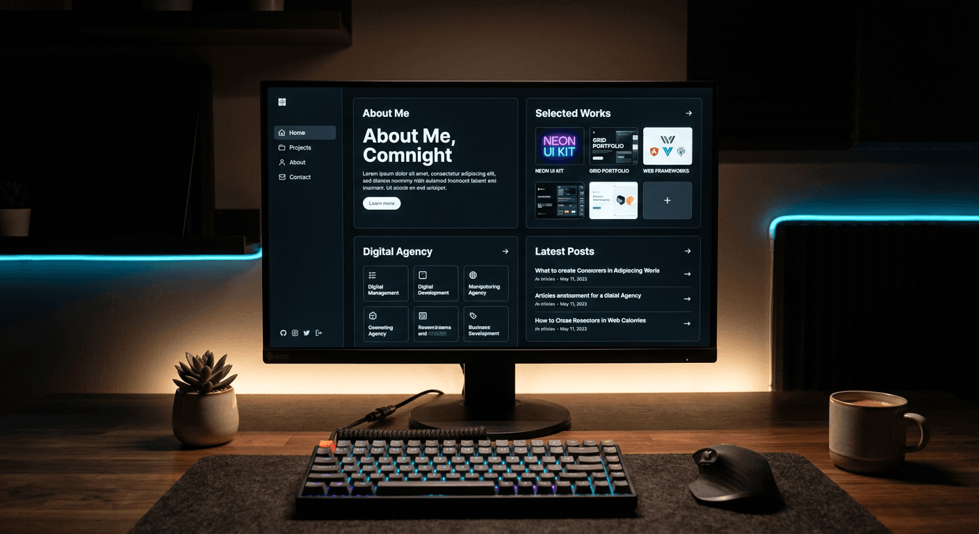
Most founders look at heavily animated gallery sites and assume elevating their visual identity requires migrating their entire operation to a custom-coded architecture. The reality is that visual differentiation relies less on bespoke JavaScript animations and more on structural constraints: typography scaling, grid alignments, and load-time discipline. A heavy site that takes four seconds to load bleeds traffic before anyone sees the aesthetic. Real website design inspiration comes from understanding which visual systems direct attention to a checkout button without taxing the browser.
Quick Summary
Evaluating website design inspiration means measuring aesthetics against performance drag and conversion clarity. High-impact design systems range from minimalist grid structures to brutalist layouts, each carrying specific technical trade-offs. The right approach balances visual identity with loading speed and direct user navigation.
- Brutalism sacrifices ease of use for aggressive brand memorability.
- Bento grids maximize screen real estate for multi-link destinations.
- Typography-driven design creates visual motion without bandwidth costs.
- Heavy micro-interactions require custom, expensive hosting architectures.
Table of Contents
- Why performance drag dictates website design inspiration
- 1. Brutalist web design
- 2. Bento Box Grid Interfaces
- 3. Monochromatic Minimalism
- 4. Kinetic Typography Headers
- 5. Dark Mode with High-Contrast Accents
- 6. Single-Page Scrollytelling
- 7. Neumorphic Micro-Interactions
- Which aesthetic matches your operational reality
- FAQ
- Recommended Reads
Why performance drag dictates website design inspiration
When analyzing website design inspiration, the standard metrics of beauty are insufficient. Practitioners evaluate frameworks based on two strict criteria: performance drag and conversion clarity. Performance drag measures how many milliseconds every Document Object Model (DOM) node and external JavaScript library adds to the critical rendering path. A visually stunning framework that relies on massive external libraries creates friction before the user even sees the layout.
Conversion clarity measures whether the aesthetic highlights the core action or hides it behind artistic choices. Every design decision must serve the structural hierarchy of the page. If a layout requires a user to search for the primary navigation, the design has failed, regardless of how novel it looks. The following approaches demonstrate how to balance these two constraints effectively.
1. Brutalist web design
Aggressive differentiation at the cost of cognitive load
Stripped down to raw HTML, brutalist web design intentionally rejects the smooth, polished aesthetics of modern digital products. It relies on standard system fonts, default blue hyperlinks, and harsh geometric layouts with zero CSS resets.
By exposing the default rendering engine of the browser, developers completely eliminate the rendering delay caused by complex stylesheets. The mechanism is reduction: rather than styling a button with gradients and hover states, brutalism leaves it as a native HTML <button> element. This creates a jarring, memorable experience that immediately separates a brand from the homogenized templates most competitors use.
Check this immediately: open your site and disable all stylesheets using your browser's developer tools. If the bare HTML structure does not communicate a clear reading order and hierarchy, your foundation is weak, and applying a brutalist approach will break your site entirely.
Because brutalism actively dismantles standard trust markers - soft corners, intuitive drop-downs, and polished iconography - it is highly ineffective for e-commerce. If you sell physical goods or require a high-friction checkout process, this aesthetic will drive cart abandonment. It is strictly for editorial platforms, art directors, and highly disruptive B2B service agencies.
2. Bento Box Grid Interfaces
Maximum content density creates forced categorization
Derived from physical compartmentalization, the bento box interface utilizes a strict, visible grid to separate discrete pieces of information. It is one of the most reliable website design ideas for aggregating high volumes of content into a single viewport.
This aesthetic relies entirely on the CSS Grid Layout module. Developers use grid-template-areas and fractional units (fr) to assign specific blocks of content to rigid squares and rectangles. Because the browser native handles the spatial math, the performance drag is negligible. The interface immediately tells the user exactly where one concept ends and another begins, which is highly efficient for multi-link destinations. If your operational goal is to consolidate multiple profiles and storefronts without custom coding, using HeyLink.me - One Link for Everything provides this structured layout natively.
To audit a bento grid, resize your browser window from a desktop width down to 320 pixels. If your distinct content boxes stack vertically in an order that pushes your primary call-to-action out of the first scroll depth, your grid configuration is failing.
The strict geometry of this approach is its greatest limitation. A bento layout breaks entirely if dynamic content varies wildly in length. A product title that spans three lines will fracture the grid alignment if the adjoining box only contains a single word, leaving awkward, orphaned white space.
3. Monochromatic Minimalism
Speed masquerading as high-end luxury
Restricting the entire digital interface to a single base color creates an immediate sense of premium curation. This approach is the backbone of high-end creative web design, relying on typography and spacing rather than illustration.
The mechanism involves establishing one hue and generating all depth, hover states, and borders by manipulating the alpha channel (opacity) or the lightness value in the HSL color space. Because the browser only loads a single color profile and executes simple transparency calculations, it is the most technically efficient approach to styling. It reduces cognitive load by removing color as a variable, forcing the user to navigate entirely by text scale and placement.
Run your chosen base color through a WCAG contrast checker against pure white and pure black today. If the color fails the contrast ratio for normal text sizes, you cannot use this approach without violating accessibility standards.
Monochromatic layouts lack the visual hooks required for complex interfaces. If you are building a dashboard where users must instantly distinguish between warning, success, and error states, restricting your palette removes their ability to decode the interface quickly.
4. Kinetic Typography Headers
Visual motion without the video bandwidth tax
Using text as the primary graphical element replaces heavy rasterized assets with lightweight, code-driven motion. Instead of loading an unoptimized image, kinetic typography animates the words themselves.
Developers execute this by attaching CSS @keyframes to text elements or by mapping text to an SVG <textPath>. Because text relies on vector calculations rather than streaming pixels, the browser renders the motion with almost zero performance penalty. You achieve the visual engagement of a video header while maintaining a nearly instant First Contentful Paint (FCP).
Practical rule: Never animate the element containing the primary conversion link; moving targets artificially depress click-through rates.
Inspect your animated text by highlighting it with your cursor. If the text cannot be highlighted, copied, or read by a screen reader, it is likely built in an HTML <canvas> element or exported as an image file. This directly damages your search indexing.
This aesthetic requires ruthless copywriting. The primary limitation of kinetic typography is localization and length. A layout precisely animated for a three-word English phrase will collapse when translated into a structurally longer language like German.
5. Dark Mode with High-Contrast Accents
Light deprivation forces attention to the accent color
Leveraging a deep black or dark gray background punctured by single, highly saturated accent colors is standard for technical and developer-focused tools. It communicates modernity while heavily dictating user attention.
The approach relies on modern OLED screen technology, where black pixels are turned off entirely. By utilizing a completely dark background, any illuminated pixel stands out aggressively. Developers use a single neon HEX code strictly for interactive elements - buttons, toggles, and text links. The extreme contrast ratio ensures that the user cannot miss the conversion point.
Check your text blocks immediately. Using pure white text (#FFFFFF) on a pure black background (#000000) causes astigmatism halation - a glowing blur effect - for a significant portion of readers. Soften your paragraph text to a light gray (#E0E0E0) to reduce the strain.
This aesthetic is notoriously poor for long-form reading environments. If your primary product is a newsletter, a blog, or any dense written content, dark mode causes severe eye fatigue over prolonged sessions, leading to high bounce rates.
6. Single-Page Scrollytelling
Linear narrative control demands total user compliance
Hijacking the standard scroll bar to trigger sequenced animations instead of moving the user down the page is a hallmark of high-budget productions. It treats the website as a presentation rather than a document.
This mechanism relies on the Intersection Observer API. As an invisible trigger point enters the viewport, the script locks the user's scroll position and plays a CSS or WebGL animation. It is heavily utilized in award winning websites design to tell a controlled, linear story, ensuring the user sees exactly what the brand wants, in the exact order intended.
Practical rule: If a returning user cannot reach your pricing or contact information within two scrolls, the design is actively preventing a sale.
Try navigating your primary landing page using only the keyboard's spacebar and arrow keys. If the animations fail to trigger, sequence out of order, or the page jumps erratically, your scrollytelling architecture is entirely broken for non-mouse users.
The critical limit here is returning visitor frustration. Scrollytelling is inherently hostile to users attempting to complete a transactional task. If someone returns to your site simply to find a login button or a phone number, forcing them through a 30-second sequenced animation guarantees they will leave.
7. Neumorphic Micro-Interactions
Constant tactile feedback requires heavy styling calculations
Simulating physical extrusion, neumorphism creates user interface elements that appear pressed out of the background material, resembling physical plastic buttons. It focuses heavily on tactile state changes upon hover or click.
This is achieved by layering multiple CSS box-shadow properties on every element. Developers apply a light shadow on the top-left edge and a dark shadow on the bottom-right edge to simulate a single, diagonal light source. When a user clicks, the shadows invert to an inset property, making the button appear physically depressed into the screen.
Print your homepage out on a standard black-and-white printer. Neumorphism relies entirely on highly subtle shadow contrasts. If the structural boundaries of your buttons disappear completely on paper, they are highly likely to be invisible to visually impaired users on screens.
The rendering calculation required for multi-layered CSS shadows across dozens of interactive elements is severe. On older mobile devices, scrolling through a dense neumorphic interface will drop frame rates and cause visible lag.
| Design Approach | Performance Drag | Conversion Clarity | Best Suited For |
|---|---|---|---|
| Brutalist | Very Low | Low | Disruptive B2B, Editorial |
| Bento Box Grid | Low | Very High | Multi-link aggregation, Portfolios |
| Monochromatic | Very Low | High | Luxury e-commerce, Agencies |
| Kinetic Typography | Low | Medium | Single-product landing pages |
| Dark Mode | Low | High | Developer tools, SaaS platforms |
| Scrollytelling | Very High | Low | Brand awareness campaigns |
| Neumorphic | High | Medium | App interfaces, Dashboards |
Which aesthetic matches your operational reality
Choosing a visual framework requires mapping the aesthetic to your primary bottleneck. If your problem is sheer content volume, a Bento Box layout offers the exact density you need to prevent endless scrolling. If your bottleneck is consumer trust in a crowded luxury market, Monochromatic Minimalism provides the high-end restraint required to validate higher price points.
Conversely, avoid complex architectures if you lack a dedicated technical team to maintain them. Heavy scrollytelling and micro-interaction architectures require constant patching as browsers update their rendering engines.
For most independent operations, speed and clarity win over bespoke animation. A robust grid system with optimized typography delivers visual authority without the €987 or more a month typical of traditional European custom development and maintenance. Select the approach that highlights your conversion point rather than the one that requires the most code.
FAQ
Does loading custom web fonts heavily impact site performance?
Yes. Every distinct font weight and style requires a separate file request from the server. Practitioners limit custom typography to one or two variables, often utilizing highly optimized web font formats (like WOFF2) or system fonts for body copy to prevent the browser from delaying text rendering.
How do strict grid layouts improve mobile conversion rates?
By enforcing a rigid structural hierarchy. A well-constructed CSS grid collapses into a predictable vertical stack on narrow screens, ensuring that primary calls to action remain at the top of the viewport rather than dropping below secondary content elements.
Are background videos still recommended for high-end aesthetics?
Rarely. The bandwidth tax of streaming a background video damages core web vitals and delays the loading of interactive elements. Kinetic typography and CSS-driven motion have largely replaced video as the standard for introducing movement without sacrificing speed.